The Client.
This was a project for a Media Arts and Design class. I worked with a partner on it. We both wrote the creative brief, however he had less of a background in design, so I took on the majority of the design including creating a magazine advertisement and a billboard. He made social media ads. We chose Patagonia as our advertiser, as we were both interested in an outdoorsy brand.
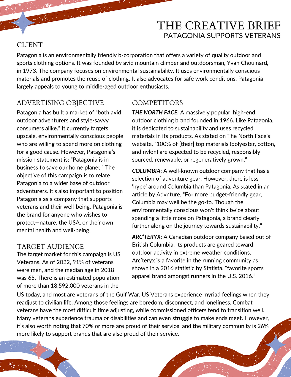
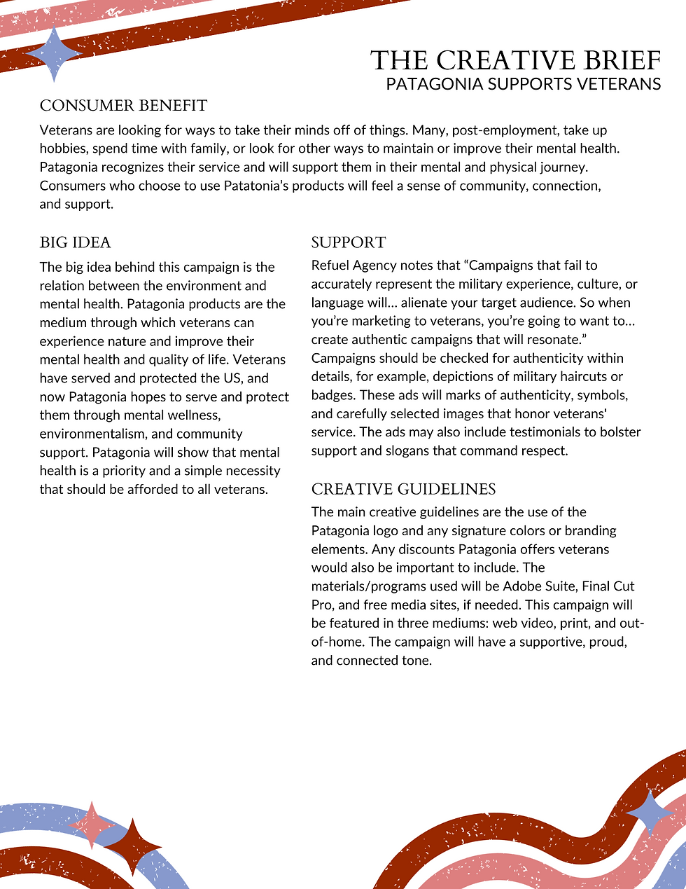

The Brief.
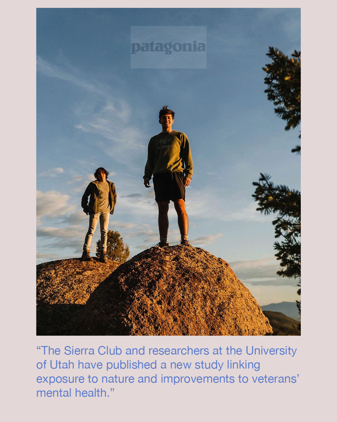
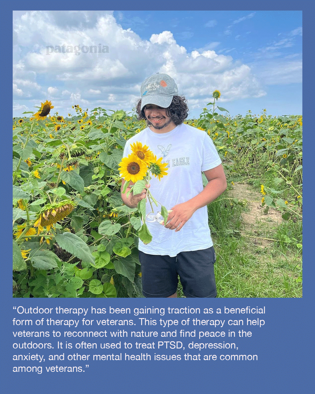
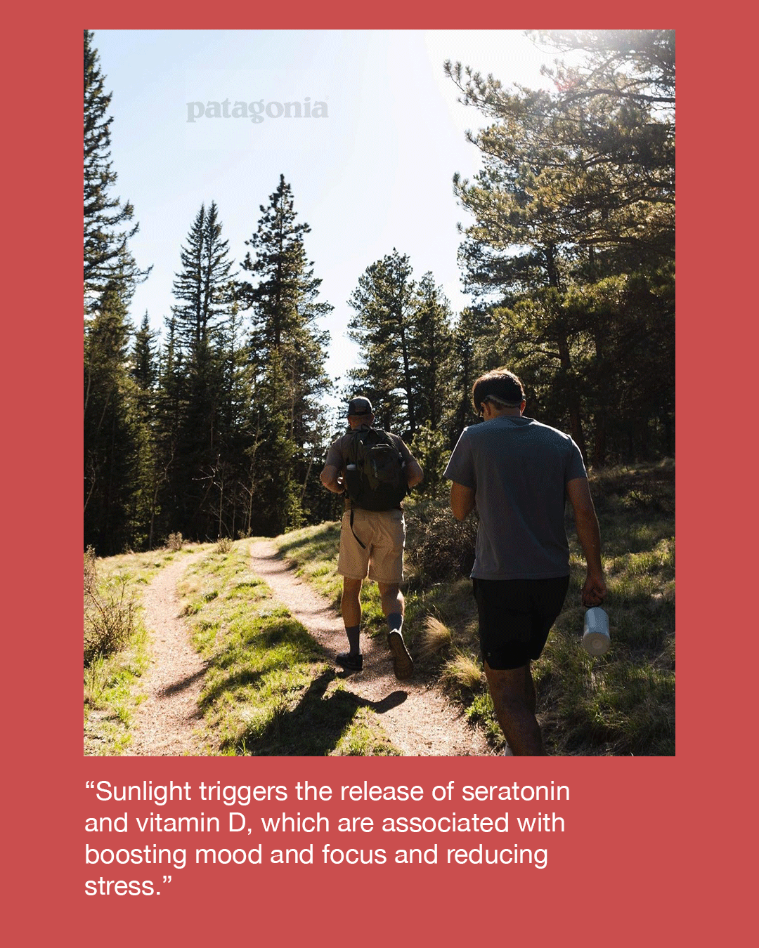
I created the top two while my partner took on the Instagram ads.
Final Design.
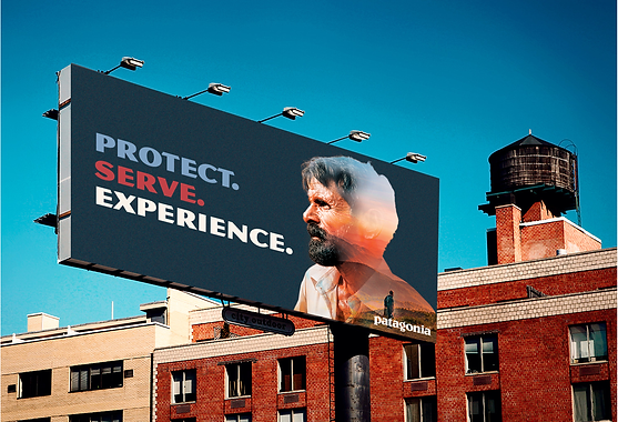
I wanted to use my Photoshop skills to demonstrate the way nature can interact with a person (particularly a veteran). This would be put somewhere on a highway outside DC or Quantico, as both of these spaces tend to have high traffic of veterans and other military members. The advertisement is simple, easy to read on a drive, and highlights the idea of experiencing nature in a respectful and uplifting tone.
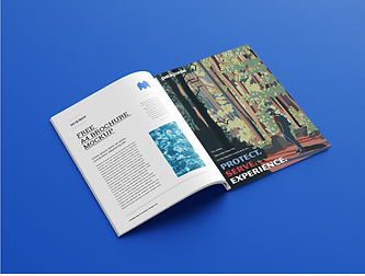
US Veterans’ Magazine would be an ideal place to feature this magazine ad. The advertisement leans more toward Patagonia‘s conventional advertisements, using a big image of nature and a small logo. However, this ad also depicts nature in a stylized art form similar to common US National Parks posters, which is something I was really happy with. It uses elements of these posters and red, white, and blue elements to target veterans, convey the openness of nature, and relate nature to a veteran’s own journey.

