

The Client.
The client for this project was Stafford High School's Cross Country Team. The coach asked that I design a senior banner (2x4 feet) for the school to display. She provided me with photos of twelve students and asked that I use the school's colors: blue and gold.
Research.
I knew little to nothing about sports posters, so I had to look at a lot of them online. I looked at past versions from the high school team, versions on Pinterest, and versions that designers are selling on the internet. It really helped me get a good idea of how a senior poster should be laid out.
I knew the way I wanted the typography of these posters to look. I wanted big block letters that conveyed a tough, stoic, sporty feel.
Roughs.

The first rough I designed, however, was boring. I liked what the type was doing, but that was it. The background was bland. Everything was centered in a dull way.
I made it my goal to convey the ideas of "speed" and "fun" in these next versions.
Options.
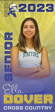
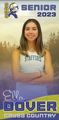
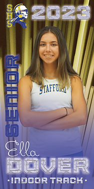
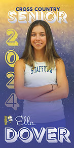
In creating the next and final draft, I designed multiple versions for the coach of the team to look through. My personal favorite was the one on the left hand side.
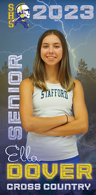
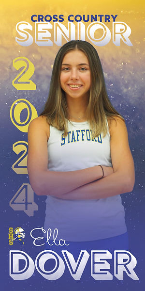
Final Design.

But wait!
There's more...
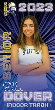
The following semester, the coach reached out to me again to design the track and field banners. They needed to "go with" the previous banners, but stand out too.
Using what I'd previously designed, I altered some things and created more options for the coach to choose between.
Options.
This one looked too similar to the previous banners.
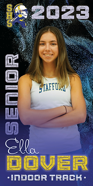
(This one was my personal favorite!)
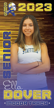
This one looked like french fries (you can't unsee it now, can you?).
.jpg)
Final Design.
Now, the Cross Country coach has me "on-call" to make her teams' banners in the future as well. You can see the the ones I create in the future here (and they will forever and always feature my sister as the mockup!)